CASE STUDY
Coinmarketcap.com
As the popularity of crypto currencies continues to increase around the world, the demand for a centralized source with easy and realtime access to all coins and tokens has grown to make Coinmarketcap the most popular site for all things crypto. Coinmarketcap is a bootstrapped aggregator of all crypto data available from API’s on the web today – made with Bootstrap 3. According to Alexa, it ranks in the top 500 sites on the web (Oct ’17).
For added context, Coinmarketcap is ranked between Hp.com 367, and Oracle.com 369, respectively. The second most popular site in the crypto space is Bittrex, an online exchange ranked at 582.
Alexa Rank
Challenge
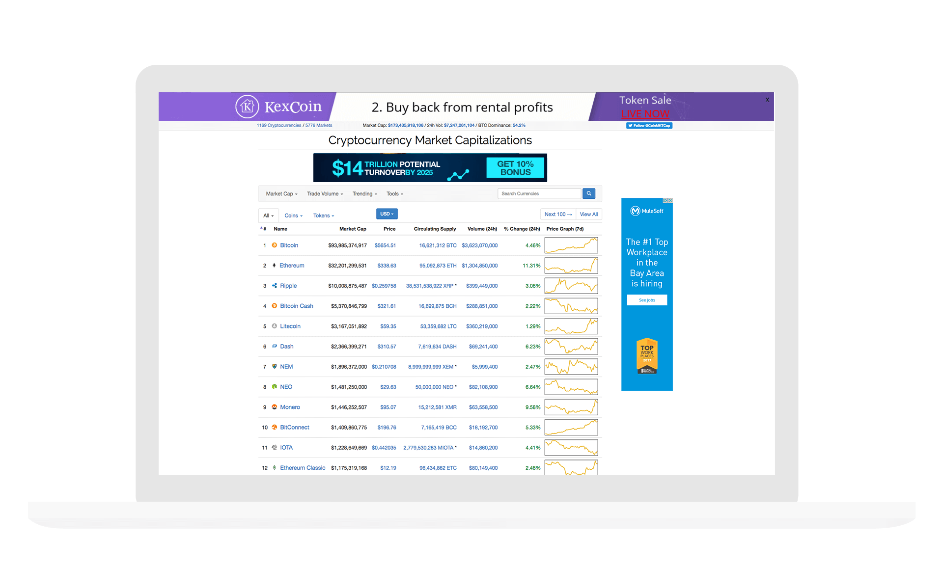
The current Coinmarketcap site has an extensive amount of data from coins and tokens, that currently don’t have follow a user flow. Evaluate Coinmarketcap and propose a better UX/UI experience. Use design thinking to discover and solve for unmeet user needs. Share your process and sketches. Lastly, how would you execute your solution in 3 months.
Insights
The first step was to frame a question, “How might we improve the UX / UI experience for Coinmarketcap.com?”. Secondly, gather inspiration from user research. Without any onsite analytics or user test groups, I researched Alexa and Twitter for insights into unmeet user needs.
Alexa
- Predominently male
- Age 25-34
- No Children
- Mostly Hispanic and African
- 25.7% of visits from USA (runnerup India 4.9%)
- Browses from home
- 4M unique monthly users (USA)
- 7 min on-site time
- 9 visits per visitor
- 4 page views per visit
- 35 monthly page views per visitor
- 50% bounce rate
- “Ethereum” accounts for 9% of search traffic
- Desire to download charts to CSV
- Confusion about market cap highs
- Enjoy making predictions
- Users tend to follow a small group currencies
- Performance of new coins
You guys just added a log scale button to your charts. I love you. That's all.
Can we download full history in .csv file?
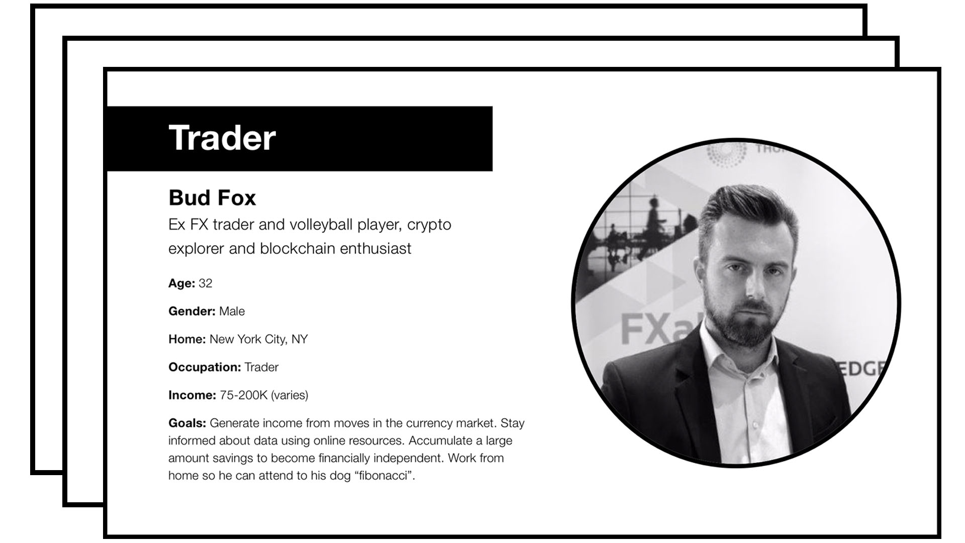
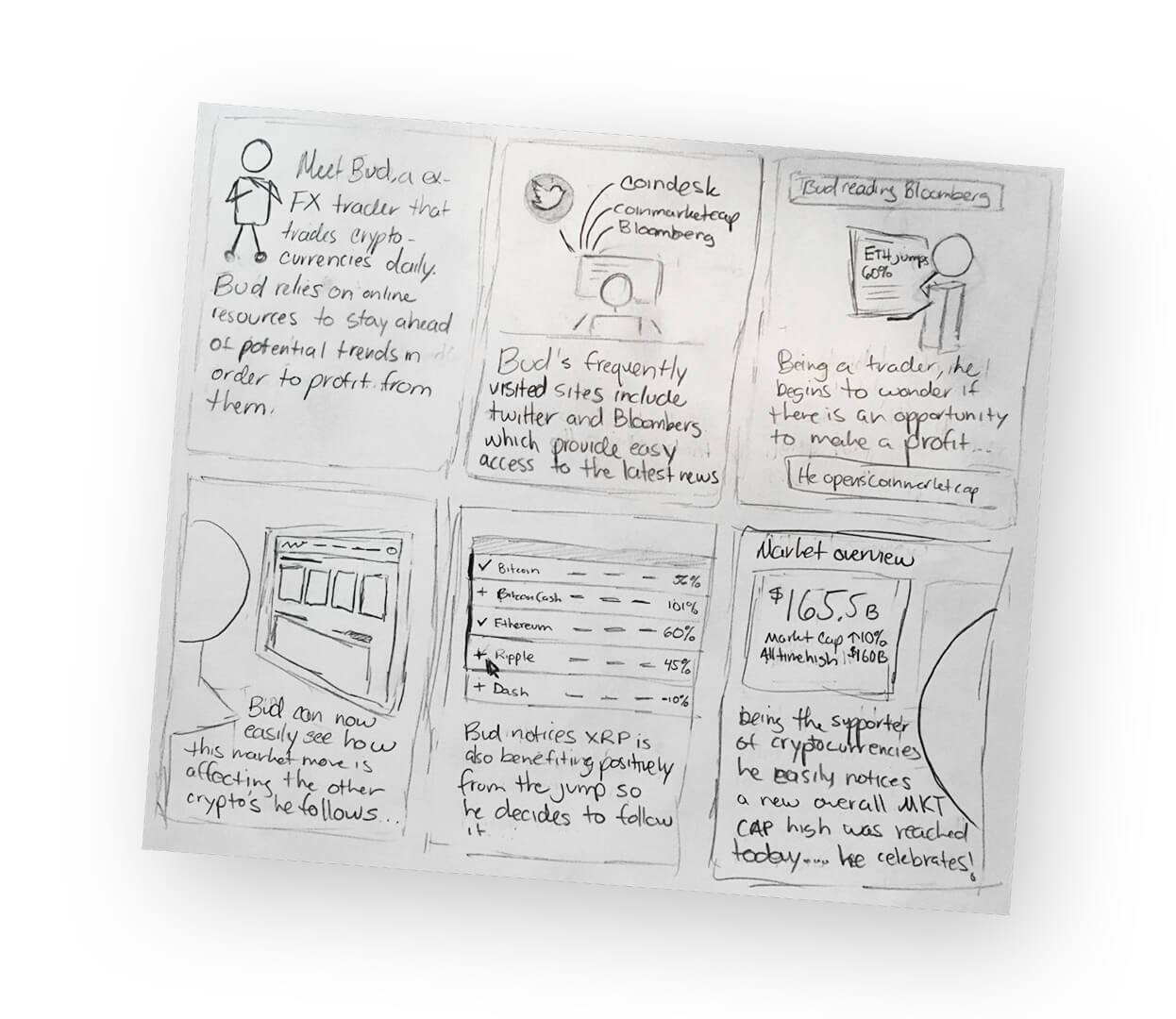
With enough insights gathered, I created 3 personas: Trader, Enthusiast, and Enterprise – focusing only on the trader persona for the scope of this case study.
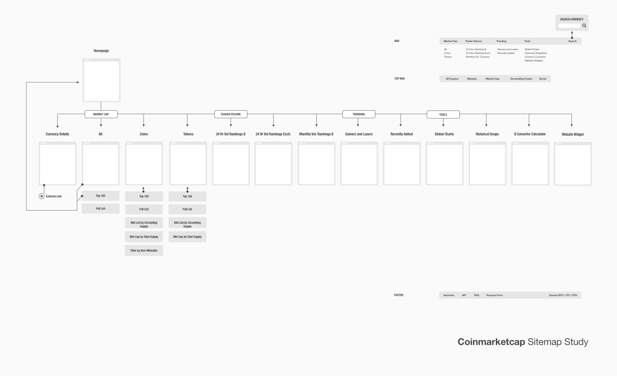
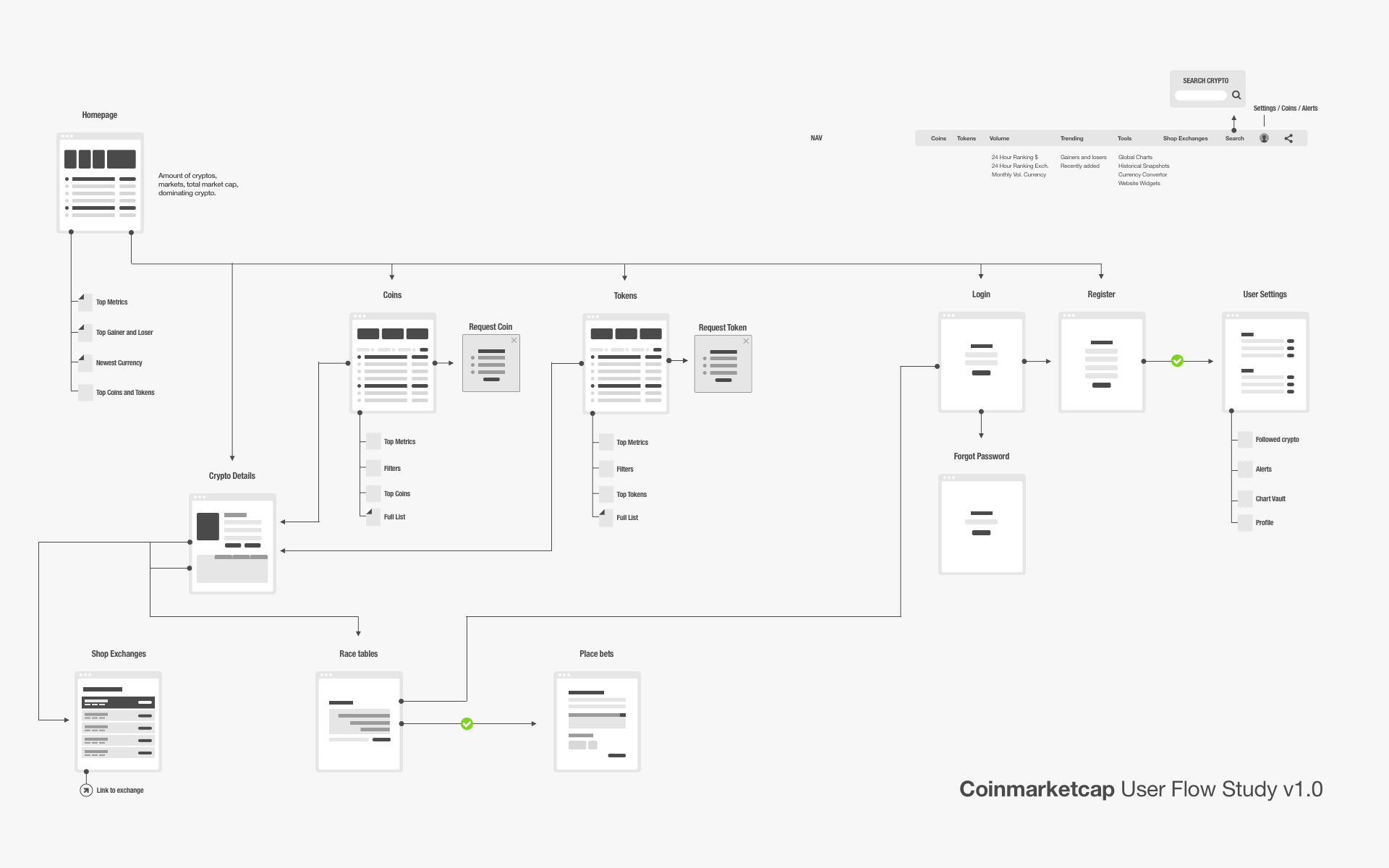
Next came the sitemap in order to see a full picture of the current site flow. I experienced the site as a user and made a list of what was working and wasn’t.
Observations / Walkthrough
- Homepage, all, top 100 (same page)
- Coin and top 100 (same page)
- Token and top 100 (same page)
- “Trader Volume” rename to “Volume”
- Requires several clicks to locate currencies of interest
- Clickable elements without context
- Excessive AD’s
- Missing 404
- Fast page load time
- Comprehensive list of all currencies
- Ability to buy currency on the details page
- Useful tools like market share percentage
- Trend pages (i.e. gainers and losers)
- FREE
Mashup
The mashup method from Design Thinking was used to generate ideas that align with user needs. During this part of the Design Thinking process, I didn’t hold back from coming up with silly, or impractical ideas. As long as they connect with the problem at some level. The intent is to explore ideas that could offer clues towards a feature that is truly meaningful for the user.
Ideas
- Chart + Vault
- Volume + Security officer
- Price + Branch manager
- Margin + Security
- Orders + Teller
- Crypto + R/C cars
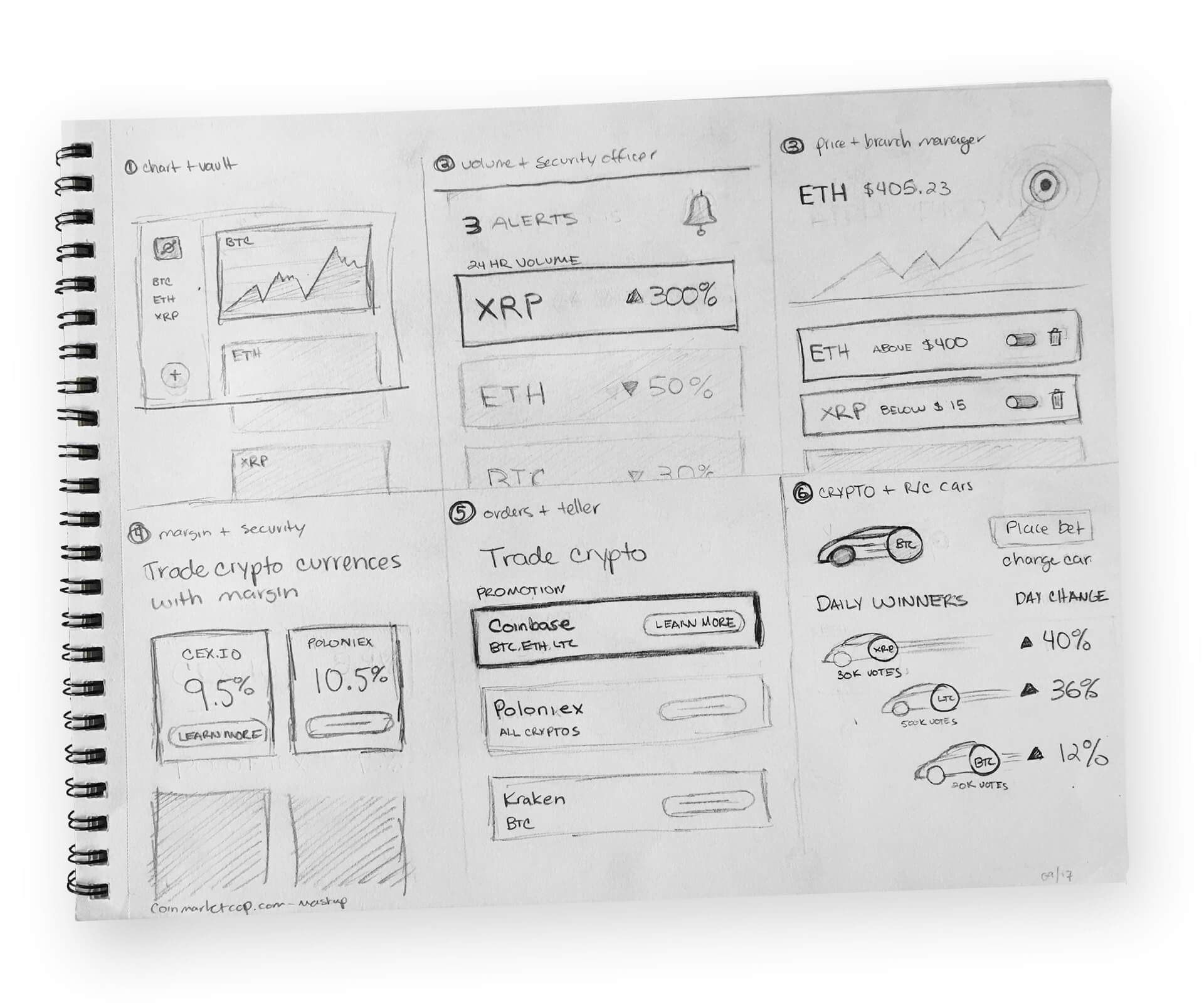
Make ideas tangible
After the fun mashup phase was over, it was time to revisit the sitemap and make some improvements. Then create wireframe sketches for use in rapid collaboration. Lastly, telling a story through user journey.

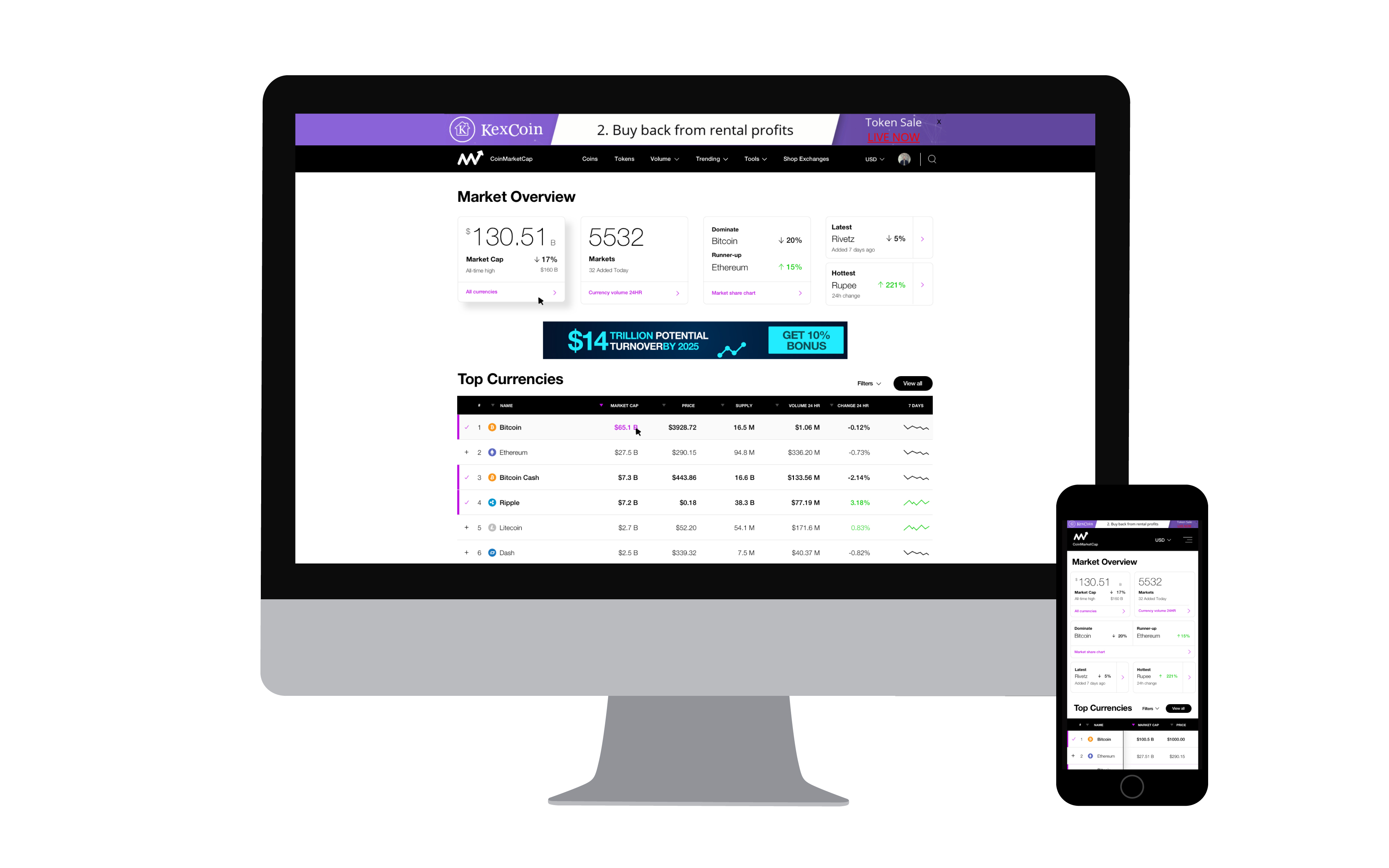
Design
Now users can easily keep track of their favorite crypto currencies, and stay up to date with key market data. New product features include account creation, the ability to follow coins or tokens, and dashboard that prominently displays key market info in real-time, such as market cap, latest / hottest crypto currency, and dominate / runner-up coins. A redesigned navigation , search, and footer. UI improvements include a new logo and a minimalist look and feel in order to keep focus on what the user cares about most: data.
The mobile experience also includes improvements, such as the ability to scroll horizontally through the tables and optimized font and table sizes.

