Product Design
Easier sorting for car rental shoppers
Hotwire is an online travel site offering Hotels, Car rentals, Flights and Vacation packages. Their bread and butter comes from a product type known as Opaque. The customer doesn’t know the name of the hotel or the brand of car rental until they book – basically a mystery deal. This is my story about how I discovered a problem during user testing and solved the problem as team.
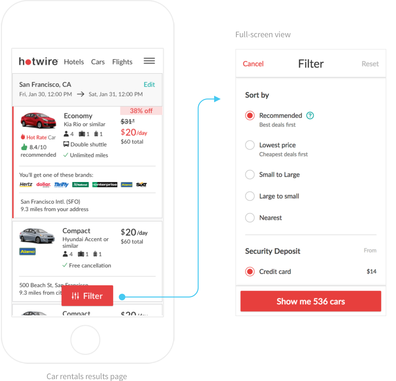
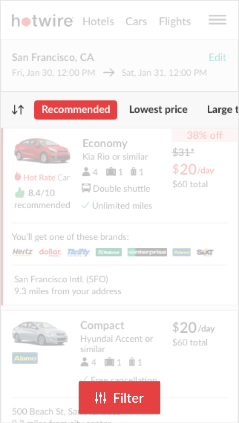
Car shoppers are able to narrow down their results in a couple of ways: sorting or filtering. On the mobile web experience, the sorting option is located inside the “Filters” view, which is a discoverability concern. User testing revealed that for car shoppers, “Filter” does not necessarily include “Sorting”.
If we make it easier for the car shoppers to discover our sorting options, we will increase engagement and conversion.
Problem solving has always an exciting task for me, but it is more interesting and engaging if the problem is well understood and validated. Whether that is through analytics, customer complaints, user testing, or any past tests that could help inform the design. For this problem, I considered analytics data and a related previously ran version test.
15%
Sorting or filtering
CVR lift
50%%
Sorting options only
Engagement (all sorting and filtering)
75%%
Lowest price
Engagement (sorting option)
15%%
Sorting and filtering
CVR lift
Sorting vs. Filtering (engagement)
Most popular sorting option
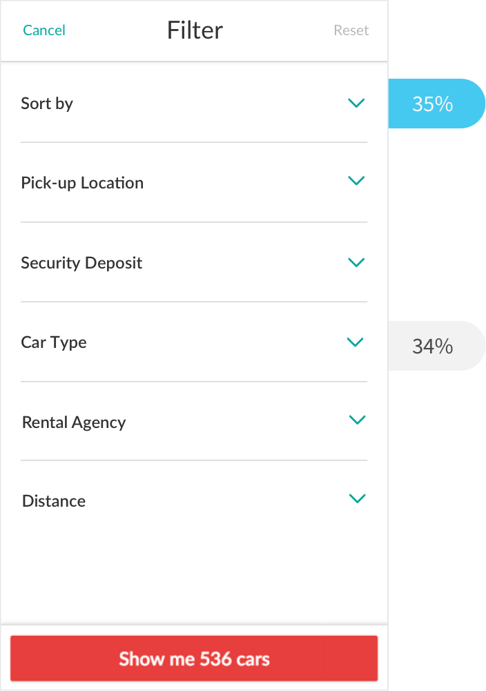
Collapsed filters (previous test)
When users were forced to toggle a sort or filter option, overall sorting engagement dropped to 35% vs 50% on control, closely followed by filtering by car type at 34%. A huge drop-off followed for the remaining filter’s at 9% or lower. While this test was a conversion loser and therefore productized, it did provide us a clear read on the engagement hierarchy for sorting or filtering. Lastly, we also saw the same conversion lift for the segment of users who engaged with any type of sorting option or filtering, 12% lift on variant vs 9.6% on control.
Engagement on Collapsed sort and filters
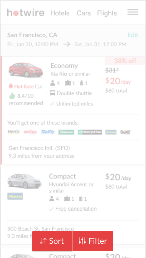
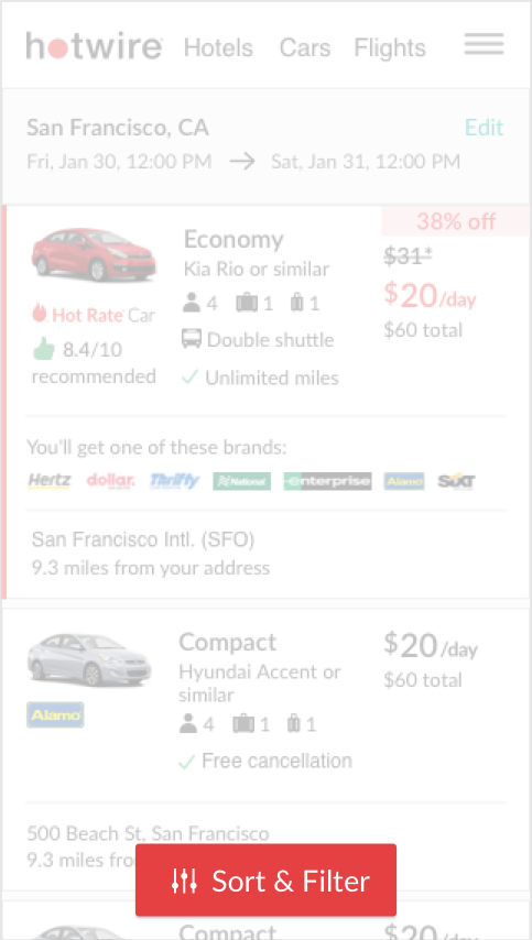
At this point, the insights have informed me that increasing discoverability of sorting is a good conversion driver, and that if over half of engagement is sorting then it might make sense to separate it into its own component or view. There were a couple ways of going about this, one was adding a sort bar to the top of the page, another was splitting the filter button into two, one for sort and one for filter, and lastly just renaming the copy and combining sort and filter.
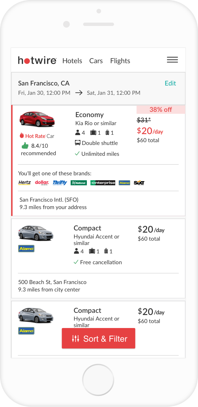
e1. Addition of “Sort” copy to filter button
e2. Addition of Sort button nex to filter button.
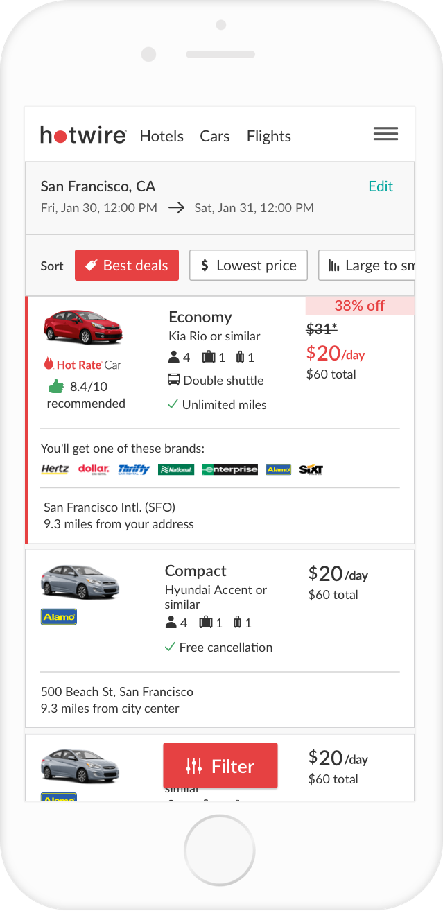
e3. Exposed sort bar at the top of the view. Prototype
After navigating through multiple design reviews that included conversations about which pattern was the best e.g. outline vs. block etc, the explorations were narrowed down to three test variants. During this process we also realized that we were using the same copy, “recommended” for the first sorting option as we did for the customer reviews component on the result cards.
Design 1 (variant)
This variant solves the problem of discoverability by explicitly stating sort options are part of the filters view.
Design 2 (variant)
This variant takes it further and solves the problem of discoverability while encouraging sort bar engagement. It includes a feature discovery animation, which triggers on load and animates left to indicate to the user that interaction is expected. The sort bar also disappears as the user navigates down the results page and reappears when they navigate back up.
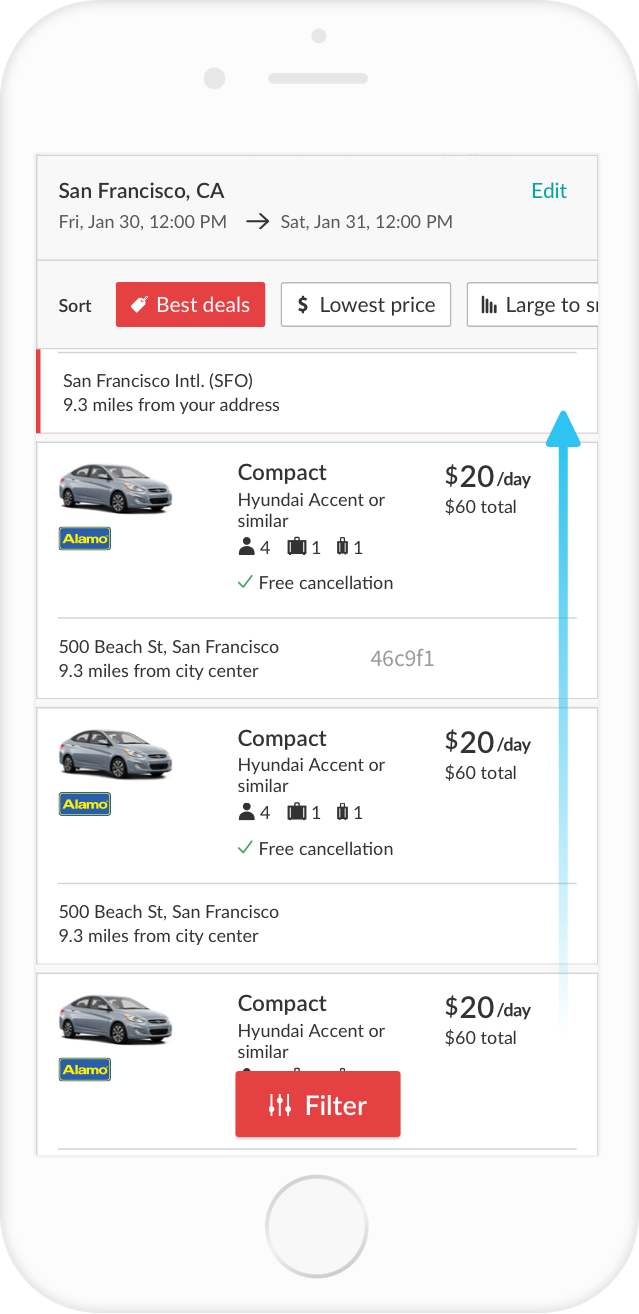
Design 3 (variant)
Similar to the previous variant, except the
sort bar doesn’t disappear, it stays persistently visible. The desired learning is whether showing the sort bar persistently as the user navigates down the results creates more value.
The second variant resulted in a 1.5% conversion lift, which considered a strong. The third variant resulted in an even higher conversion lift at 1.9%, which is projected to add over 3.2M of revenue to the car rentals product. Engagement soared to nearly 200% as users had a much easier time exploring sort options.
Showing a persistent sort bar created more value for the user than hiding it as the user navigates down the list. Also, there is tremendous value in making it easy for users to discover options that help them narrow down a long list of results. Based on data, most users convert on the first first 8 results, but when they were presented with a sort bar that was easy to engage with, it made it easier to find a rental car that met their criteria.