Product Design
Rethinking cards for rental cars
Hotwire is a travel site offering Hotels, Car rentals, Flights and Vacation packages. Their bread and butter comes from a product type known in the industry as Opaque. The way it works is that the customer doesn’t know the name of the hotel or the brand of car rental until they book. In other words a mystery deal. What follows is my story about rethinking the content is shown the cards.
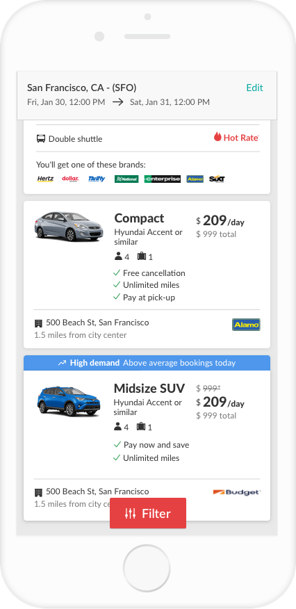
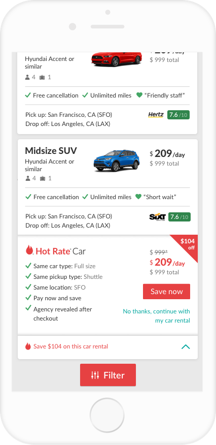
Once a car shopper searches for a rental car at a location, they are usually shown a high number of results – often over 100. Purchase data shows that most users don’t end up choosing a car rental beyond the 8th result. In addition, user testing studies revealed that car shoppers often struggle trying to narrow down and compare different results when presented with so many options.
If we show only relevant and validated content on the card, we will make it easier for the user to shop and compare between results and therefore increase conversion.
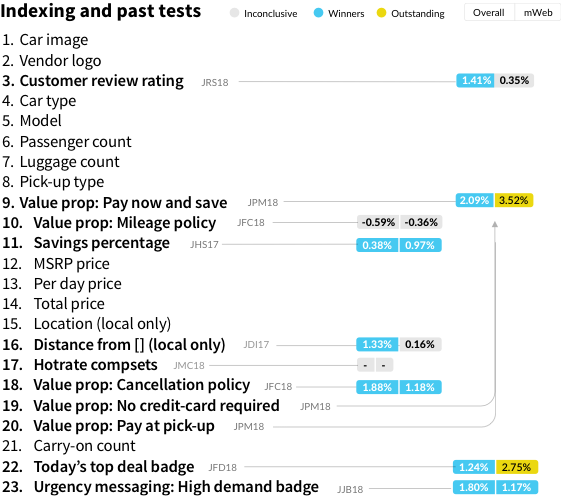
There was a lot of unfold here, so understanding the problem was very important. I began by asking my product managers if they knew what content that was shown on the result cards created the most value for the car shopper. Some content had been tested but not all. I facilitated the process with the team by indexed all the content and gathered data from previous tests – some going back all the way to 2016. This helped by allowing us to pay special attention to highly relevant and valuable content. The list below shows test results for content that was either a winner, loser, or inconclusive.
By leverage a research study that been done, which included over 1000+ participants, we were able to gather insights into the top 10 factors that a car shoppers considered during their decision making process when it came to renting a car. By leveraging this data, we were more able to closely align the design with existing user behavior in a meaningful way.
Top 10 factors:
- Price
- Location of rental agency
- Rental car size
- Time it takes to pick up rental car
- Rental agency mileage policy
- Location of rental agency in airport
- Cleanliness of rental car.
- Rental agency cancellation policy
- Ease of understanding pricing on website.
- Rental agency hours of operation
No segment considered the exact name of the rental agency to be a top 5 factor.
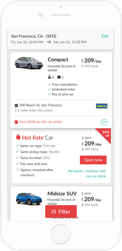
In order to design a card that closely aligned the user’s behavior, I looked at the problem from a content standpoint.
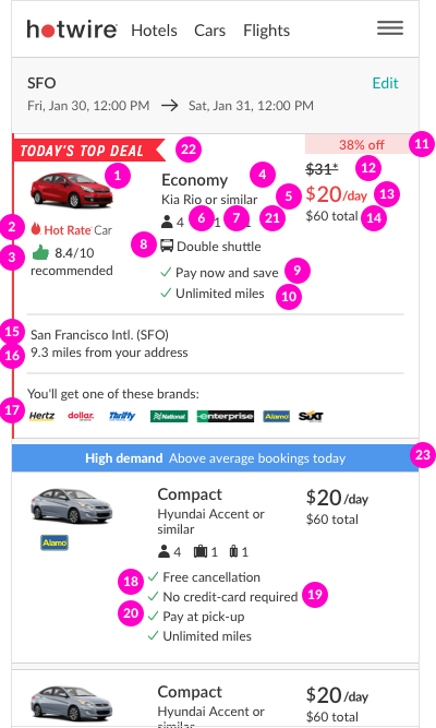
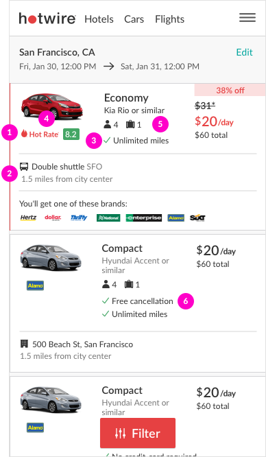
- Heat map User’s anchored to the price block, then car type (compact or minivan), model information, and car image.
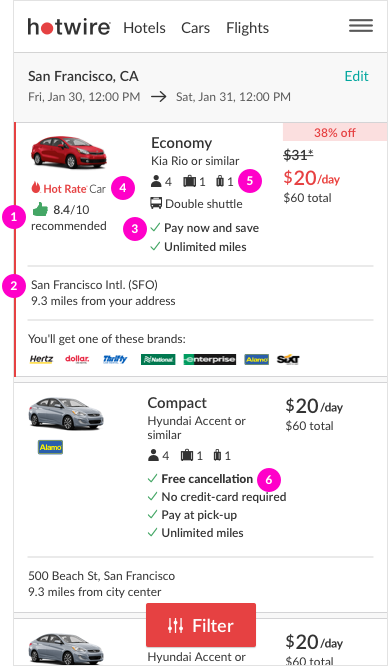
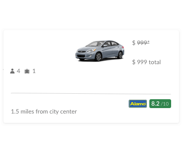
- Top factors There was some contextual problems. The location content was in two different places (address vs. pickup type). This content ranked second in the research list of top factors so grouping this would save the user some time by eliminating the need check two different places of the design.
- User testing The car image only became a factor after users had validated the price and car type.
Short bit about the height of the cards
During design reviews, some comments were made around the height of the cards that they were too tall. I agreed to some extend, since for the past few years we had just been productizing winners that had small changes but didn’t look at the layout holistically. When we looked at competitors cards, we learned our top competitor had one of the tallest cards – about twice as tall as ours. It turned out we were average height.
After collaborating with my product managers, it was time to move the design further along. Beginning with a solution to validate the existing content and then ending with a re-design. It’s worth mentioning that as a team, we agreed to attempt breaking down big changes into small testable chunks – whenever possible.
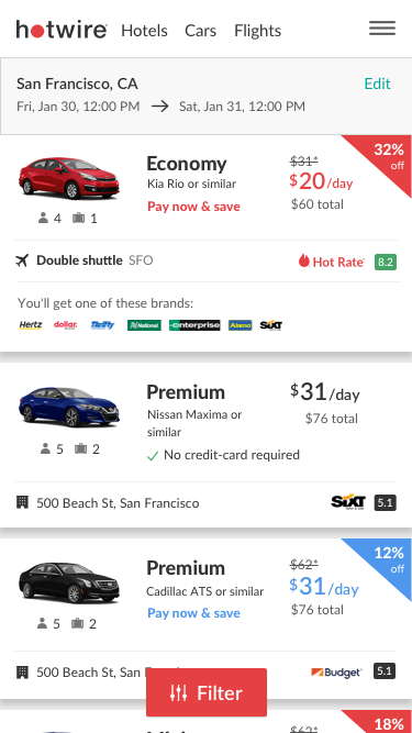
This exploration focuses on relevant or validated content with some minor styling updates. The idea here is that by removing content that isn’t creating value for the user, we can remove distractions and make it easier for the user to find what they are looking for. At the same time, setup the groundwork for the transition into a re-design.
Proposed test plan:
- Customer review content
- Hide thumbs up removal
- Hide “Recommended”
- Hide “/10” from rating
- Location content
- Reposition pickup type
- Airport name i.e. SFO
- Add icon to retail location address
- Change model text and distance text to grey.
- Value proposition content
- Hide “No credit-card required”
- Hide “Pay now and save”
- Hide “Pay at pickup”
- Use “Hotrate” logo vs “Hotrate Car”
- Hide carry-on
- Remove bold from “Free cancellation”
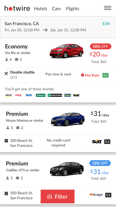
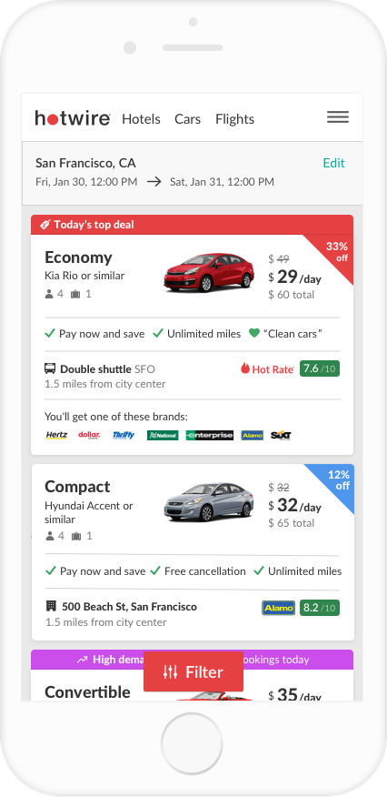
e1.0 Content validation only
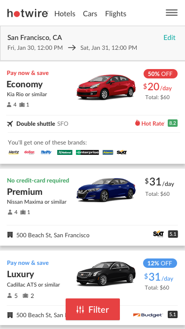
Exploration 2 – Thats a good dog
This exploration primarily focuses on using only one selling proposition vs. several e.g. “Pay now and save” or “No credit-card required.” Then taking looked at using a “Dog ear” treatment for savings copy that the hotel team had just started productized as part of their redesign. The card style helped each result stand out from the other; albeit, at the cost of having less space (narrower width).
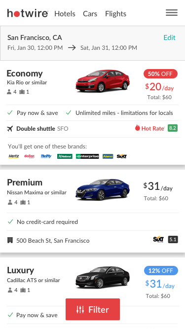
Exploration 3 – Switch-a-roo
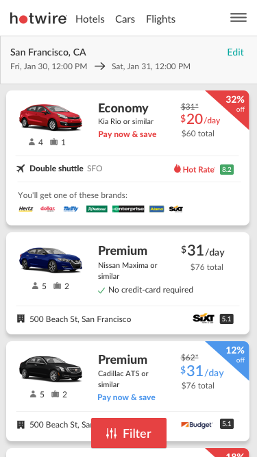
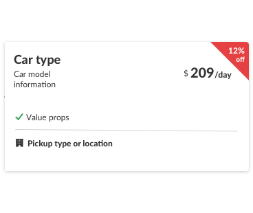
This exploration respositions the car type information with the car image, aligning with the top factors from the research study and user testing. Additionally, a horizontal layout for the value propositions was explored resulting in more efficiently use of space (going horizontal instead of vertical) and improved scalability.
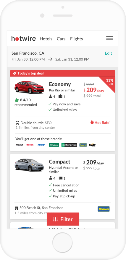
This exploration looks at the problem from a new perspective. Taking a streamline approach not for results themselves but also at list level. Influenced by analytics data showing that the sorting and car type filters are the most popular ways of narrowing down a search. Additionally, the top factors from the research study were considered by anchoring each section by the top 3 factors.
After sharing the explorations in multiple design and stakeholders reviews and getting everyones feedback, it was time to move on the design phase. Phase one consists primarily of content validation while phase two is what the future vision.
Design (Phase 1) – Content validation
This approach sets the baseline of a value driven foundation. It also helps future state of design by allowing the team to make informed decisions about what content to change. Lastly, some elements from the redesign were introduced.
Design (Phase 2) – Vision
Elements are introduced in small test groups. New features were added such as the customer review score, green 1-10 element that also aligned with our design system. Additionally, a new item was added to the value prop row highlighting the feedback from our post-booking survey i.e. “Friendly staff”. Lastly, zoning and content hierarchy styling was established. User testing is in progress along with eye tracking tests.
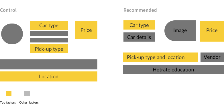
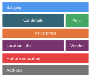
Content zones It was important to establish some guidelines and zones for content in order to avoid ending up back where we started. Each content type has its zone and will be considered for future designs.
Primary content guidelines Aligning with the research study, this style guideline establishes that primary content should be easily recognizable to the user. This is mostly done with a slightly larger font size and thicker weight.
Secondary content guidelines The secondary or tertiary content will use a more subtle color, allowing the primary content to get more recognition.